

It's time to replace your physical wallet with a digital one.
Who needs a physical wallet when you can have all your cards in a single App? Try CardSpace, your all in one mobile wallet today!
Project
Meet CardSpace
Role
UX/UI Research, Prototyping, Interaction, UI Design, User Testing.
Tools
Figma, Protopie, Photoshop, Rotato
About CardSpace
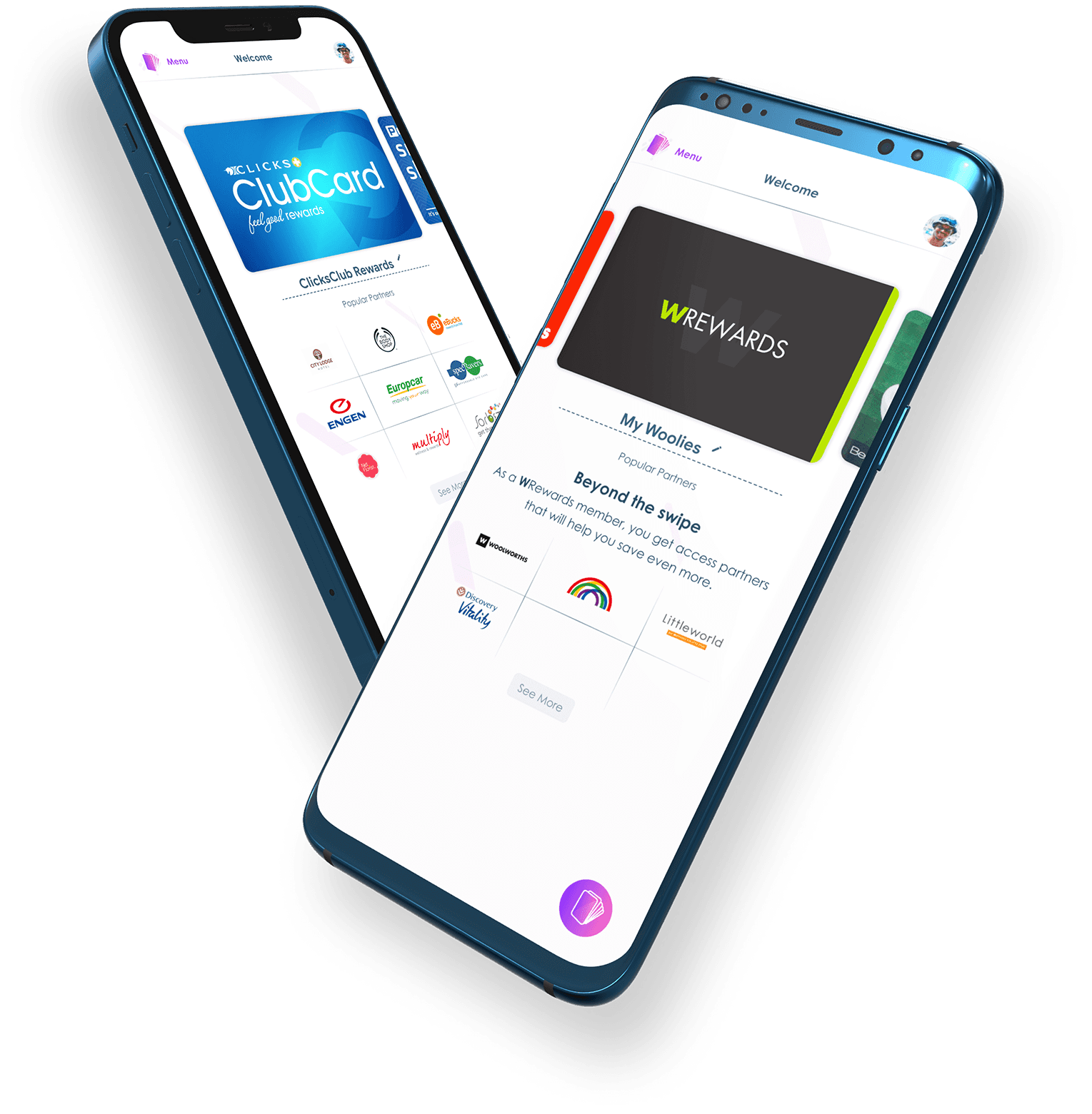
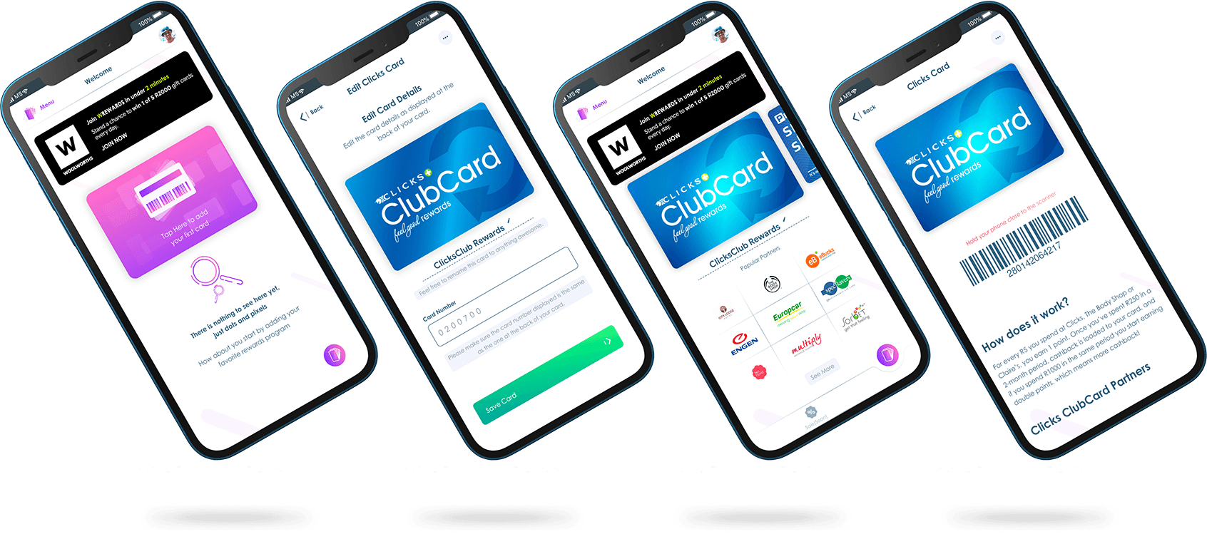
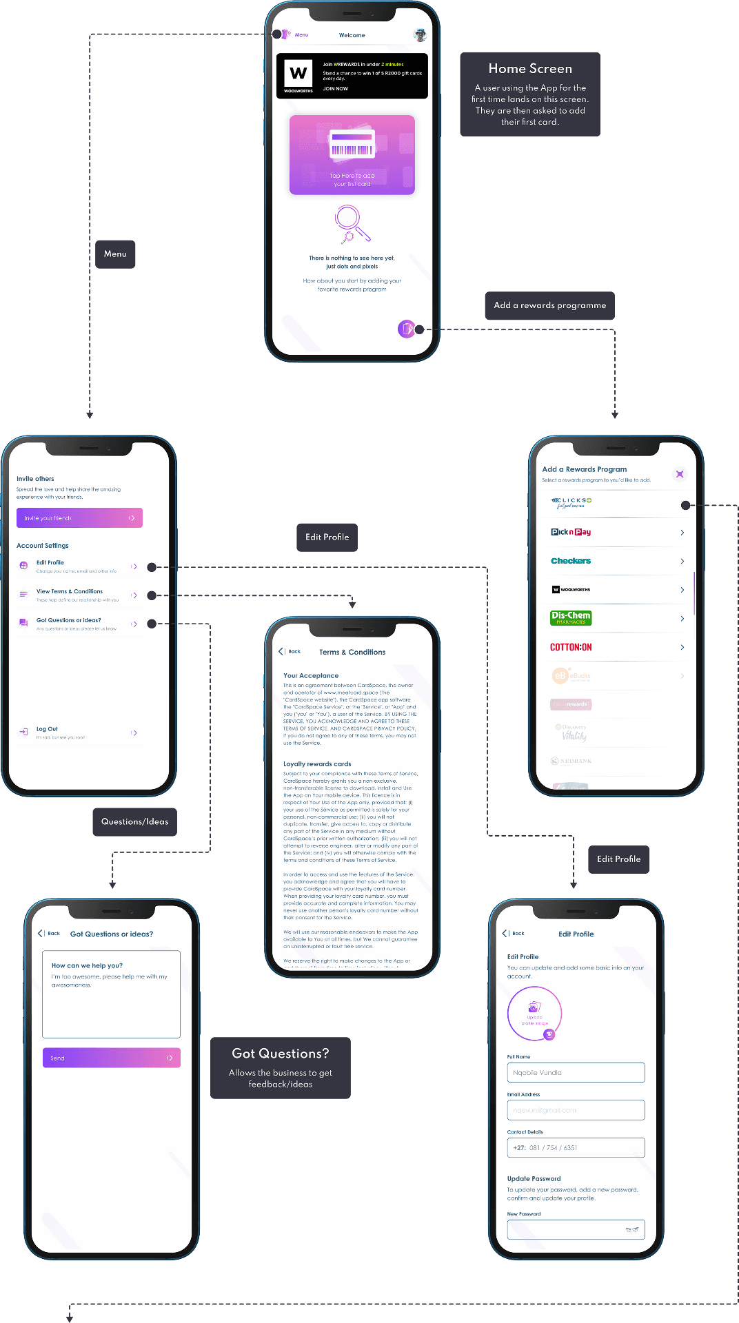
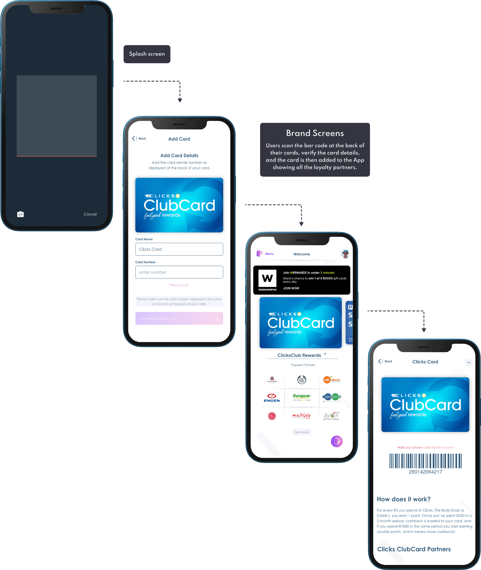
CardSpace offers a feature that enables users to add their loyalty rewards cards to their applications and manually scan them while checking out. In essence, CardSpace is a centralized rewards program that consolidates all of a user's rewards programs into a single location.
The first stage involves allowing users to add various rewards cards that they can effortlessly scan at the counter.
In the second stage, the concept will be validated based on user feedback, and other retail cards will be added.
The third stage involves contemplating the inclusion of documents such as COVID-19 certificates, IDs, and other crucial documents into the wallet.
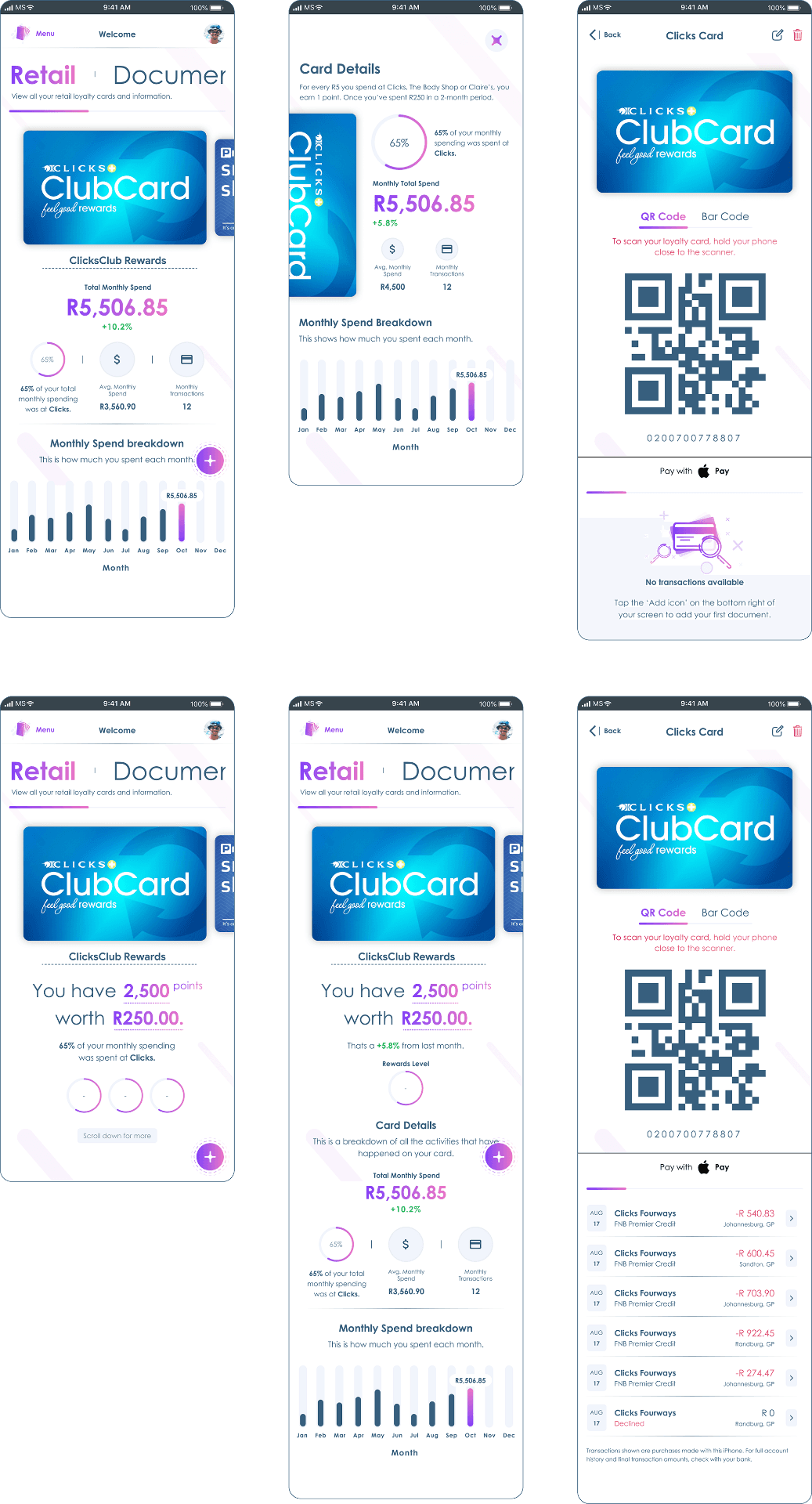
The fourth and final stage entails integrating with payment wallets like Apple Pay, allowing users to make payments directly from their mobile phones and monitor their expenditures at various retail establishments.
Building the Design System
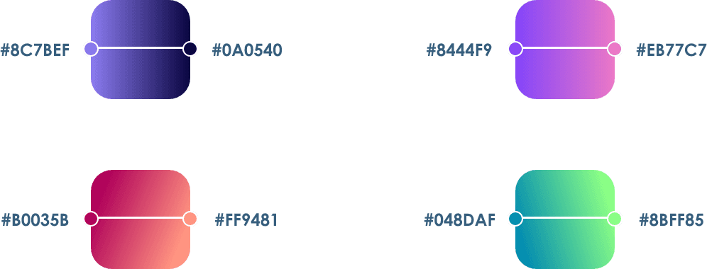
A Design System serves as the definitive source of information that enables swift product realization and development in design. By utilising a compilation of reusable components and a standardised set of guidelines that dictate the usage of these components, I can enhance my speed of innovation and creation.
Main Colours

Gradients
Font Type
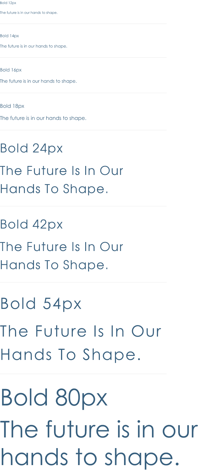
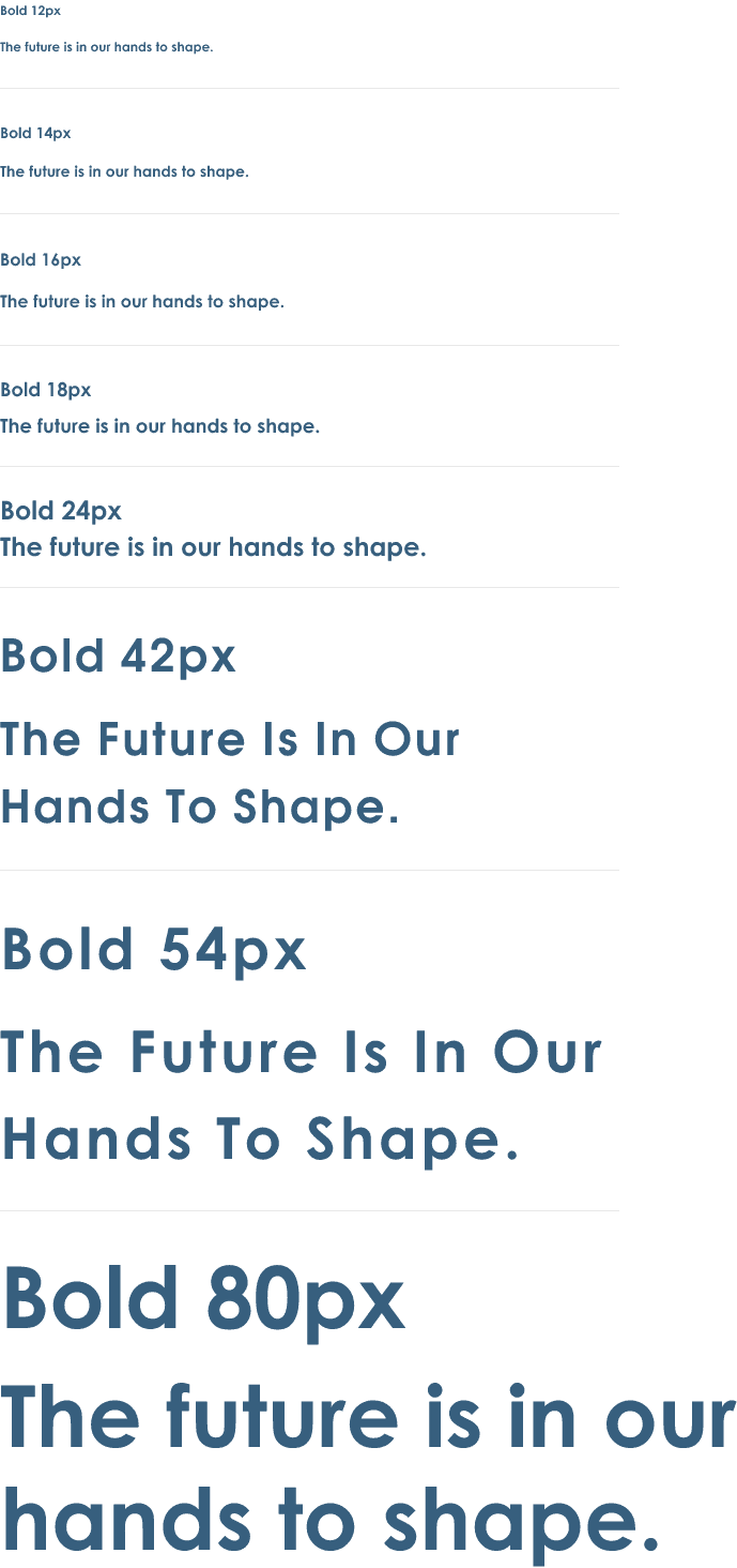
When it comes to typography, my fundamental strategy is to consistently choose the appropriate font. To ensure optimal usability and development, I favor either using a single font type or a maximum of two. It is imperative that the fonts are clean and not excessively condensed. Choosing fonts that are easy to read is crucial in delivering an exceptional user experience.
Icon Library
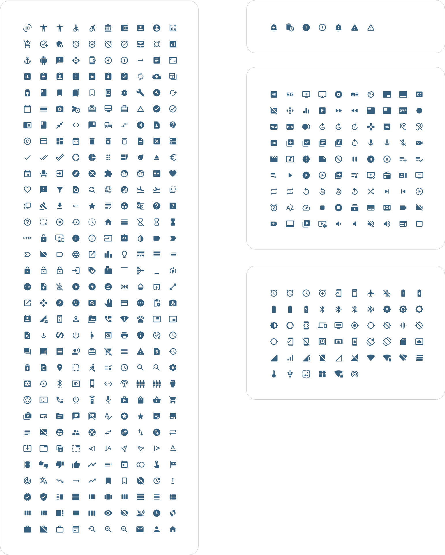
I opted to use the Material Design Icons, which are free and offer a flexible framework of principles, elements, and resources that promote the most effective approaches to user interface design. Supported by open-source code, the Material icons simplify collaboration between designers and developers, allowing teams to swiftly create visually appealing products.
Brand Logo's
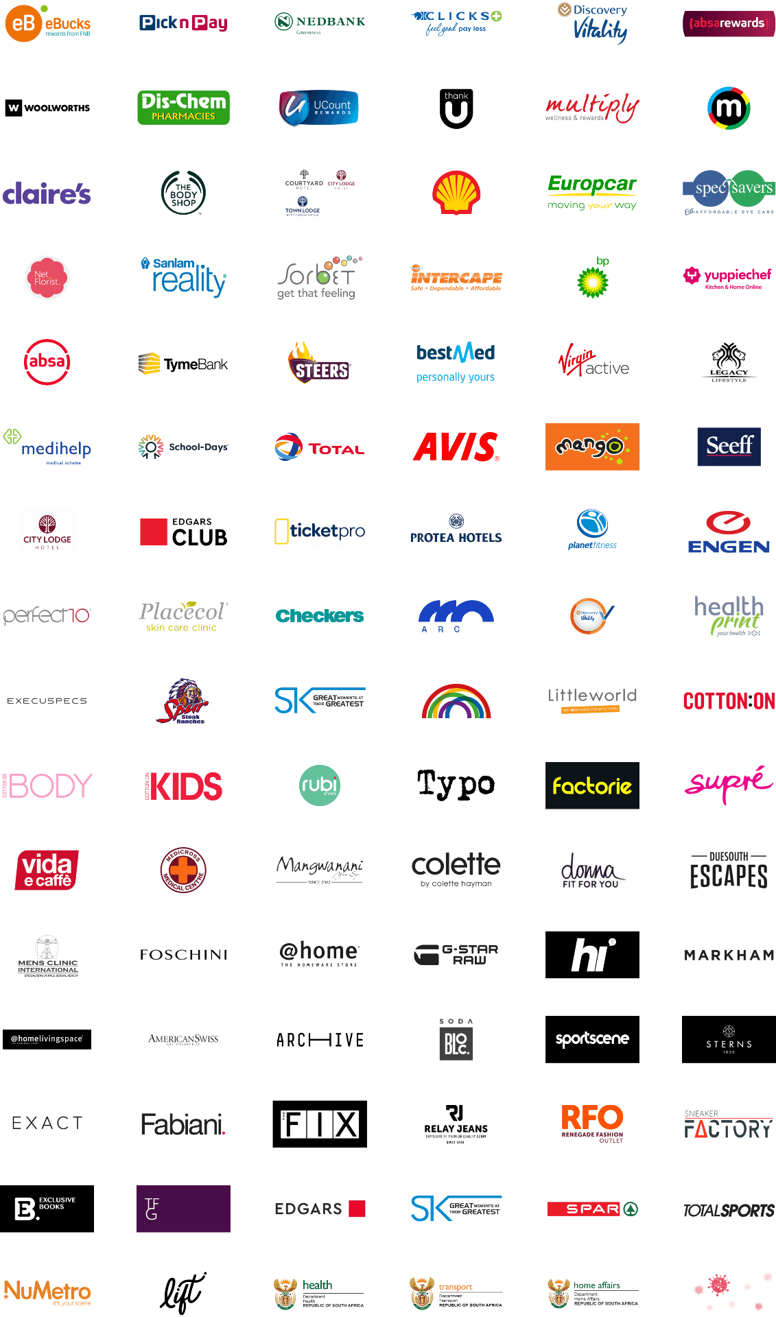
CardSpace facilitates a connection between brands and users, and sourcing logos from various brand partners and generating master components of each for repeated use throughout the app proved to be one of the most significant hurdles in designing CardSpace.
Loyalty Cards
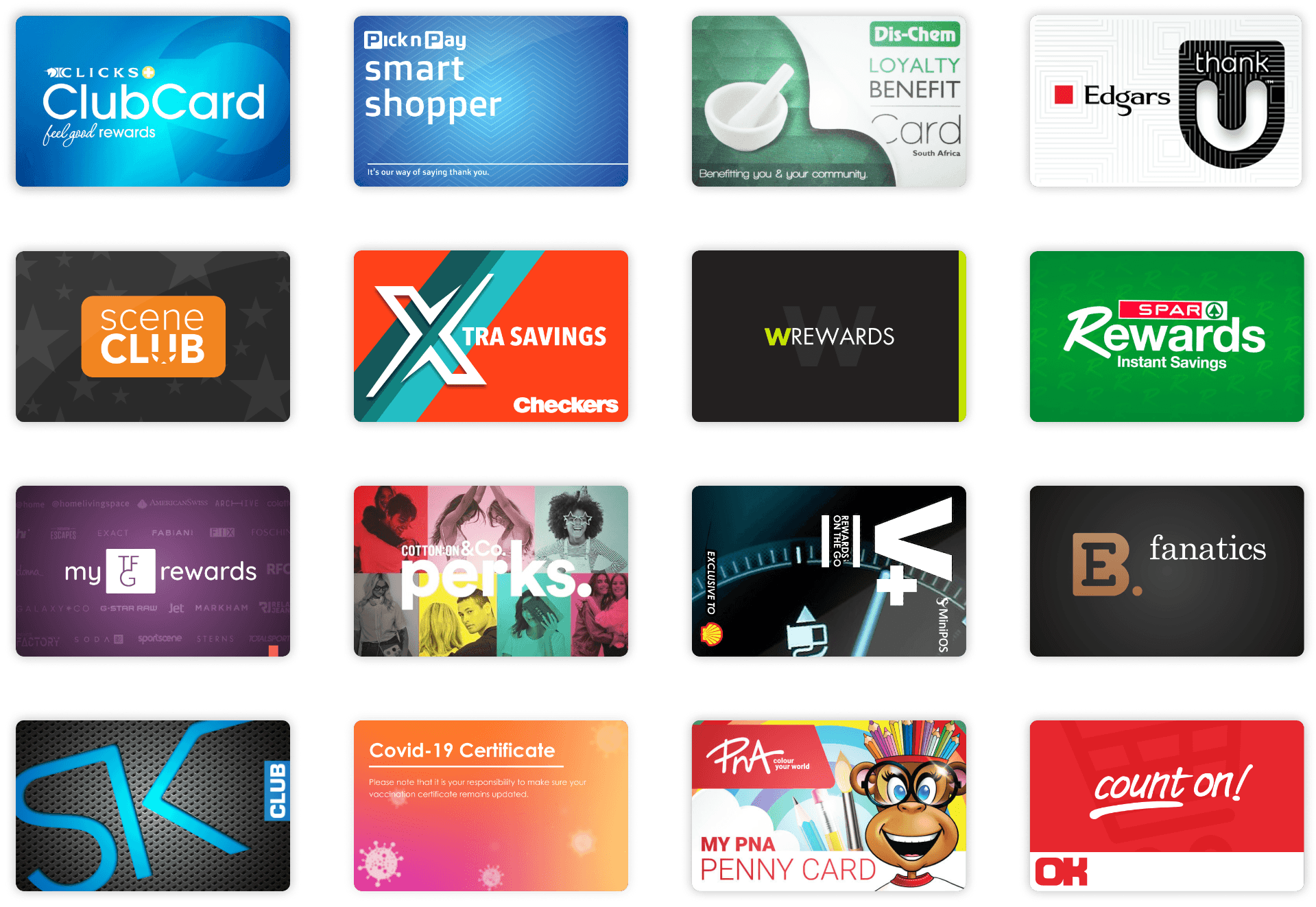
Another major obstacle was obtaining loyalty cards. Many of the cards discovered online were of inferior quality, with low resolution. Attempts to scan the cards proved to be unsuccessful, leaving no option but to redesign them, which required a considerable amount of effort.
Design Process
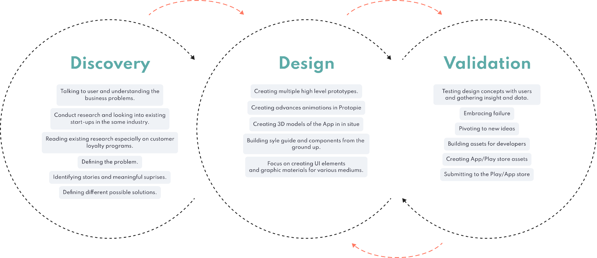
My design process entails mentally deconstructing significant design challenges into smaller, more manageable tasks. By defining the issue, gathering information, and brainstorming concepts, I can readily devise solutions that effectively address the underlying problem.
Mind Mapping
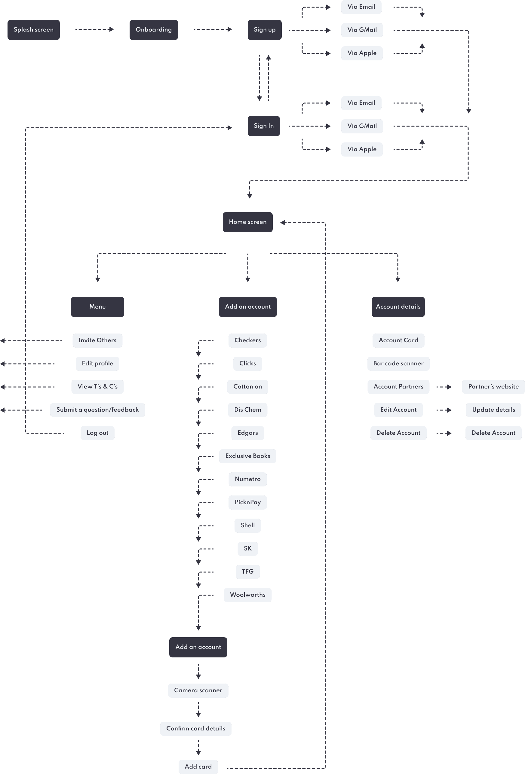
Getting caught up in minutiae is a common pitfall, which is why obtaining a comprehensive view of the user journey is vital for generating appropriate ideas. By utilising a mind map, I can prioritise essential features and maintain a user-centric focus.
Onboarding
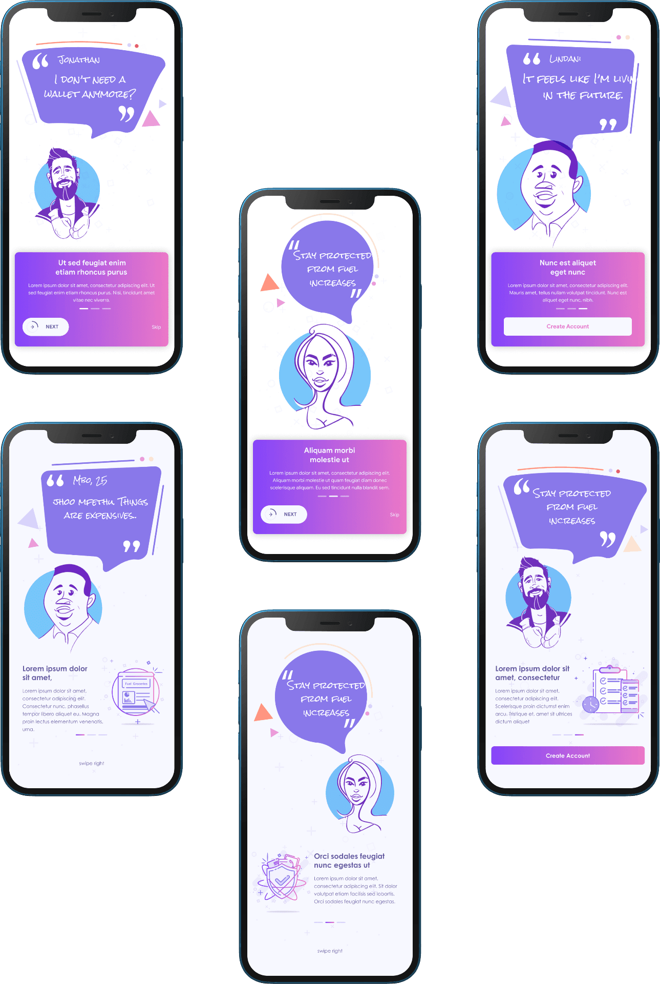
CardSpace's onboarding procedure involves a succession of screens that direct the app's interface. This facilitates improved communication between businesses and their customers, enhancing the overall user experience. Specifically, it enables CardSpace to:
Educate users about the app's functions and advantages.
Enable users to register their login credentials.
Gather profile information that can be leveraged to deliver customized content and notifications.
Sign up/in
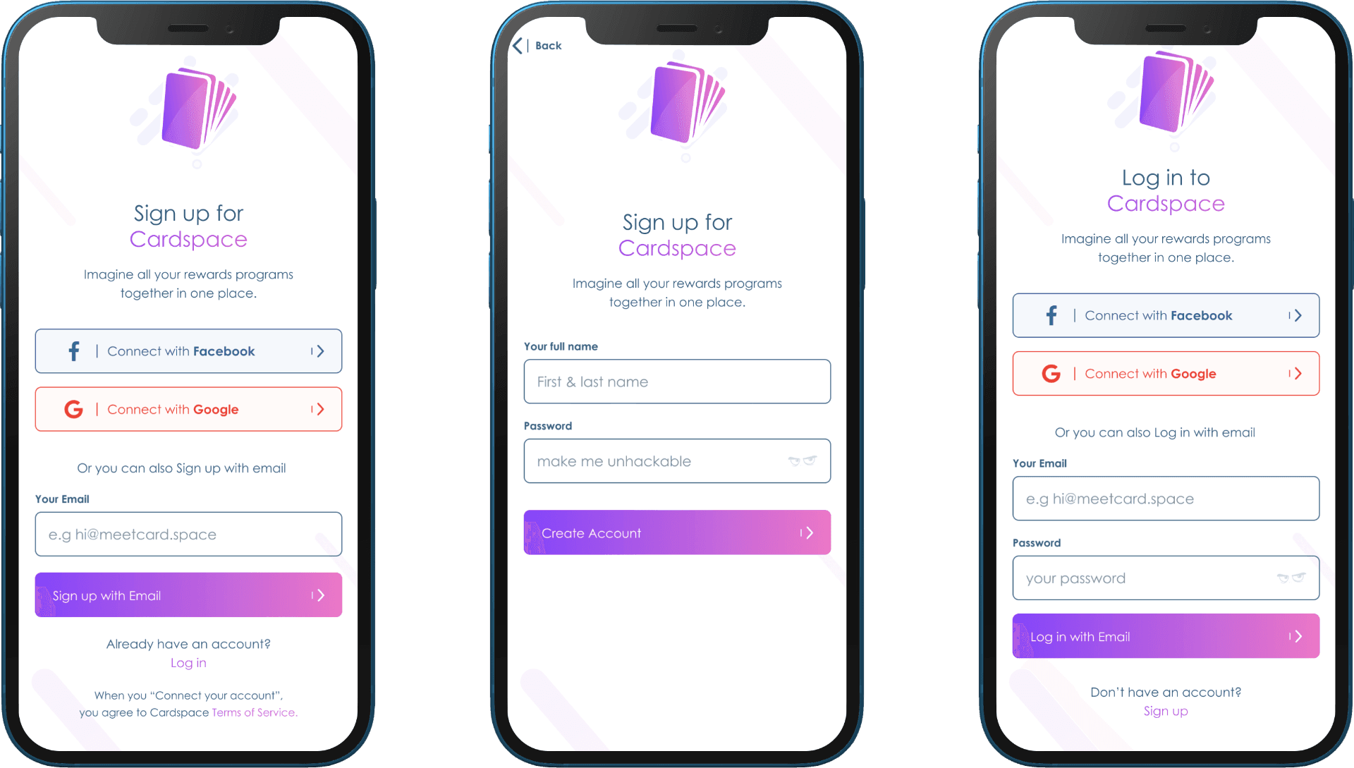
CardSpace offers users the option to either sign in/sign up using their social media accounts or via email.
Main Screens
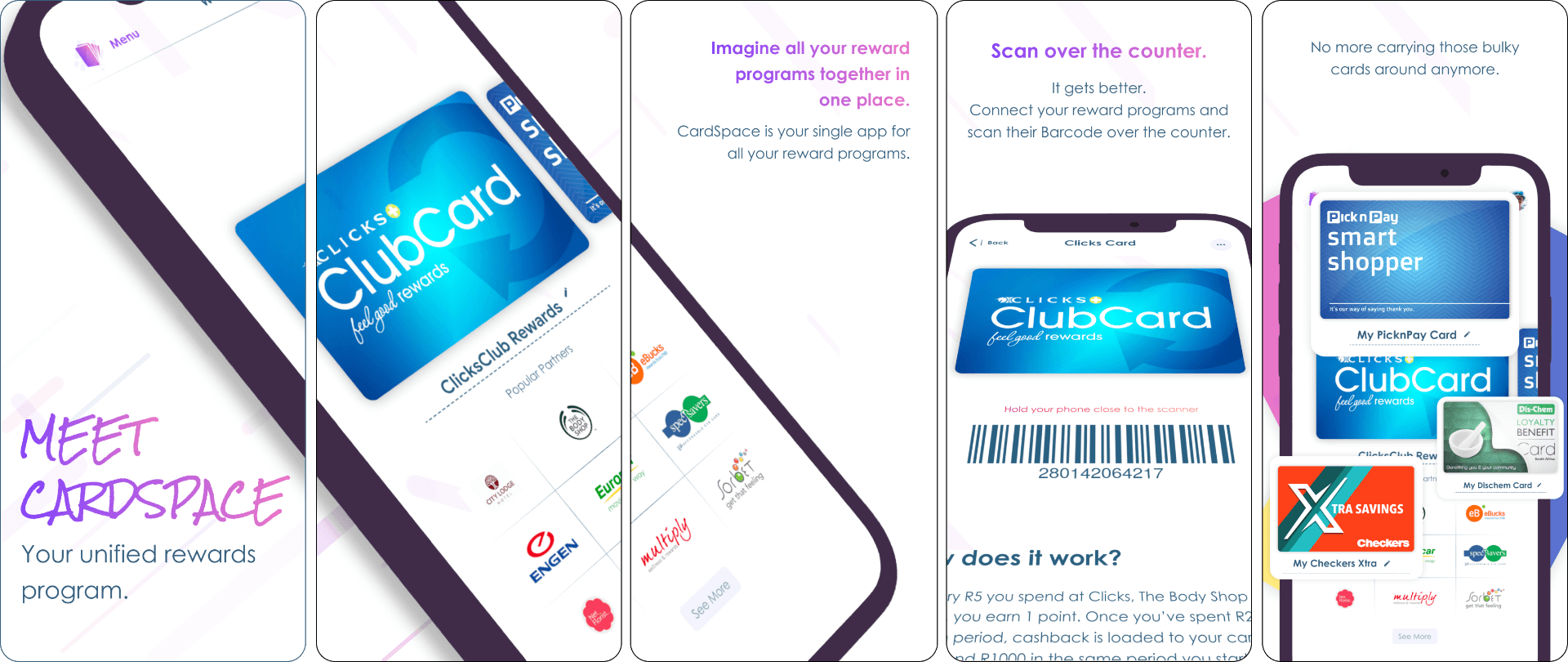
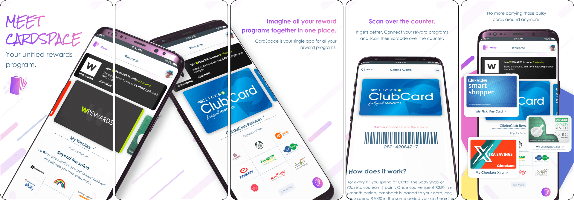
The main used screens for the App..
Other Brands Screens
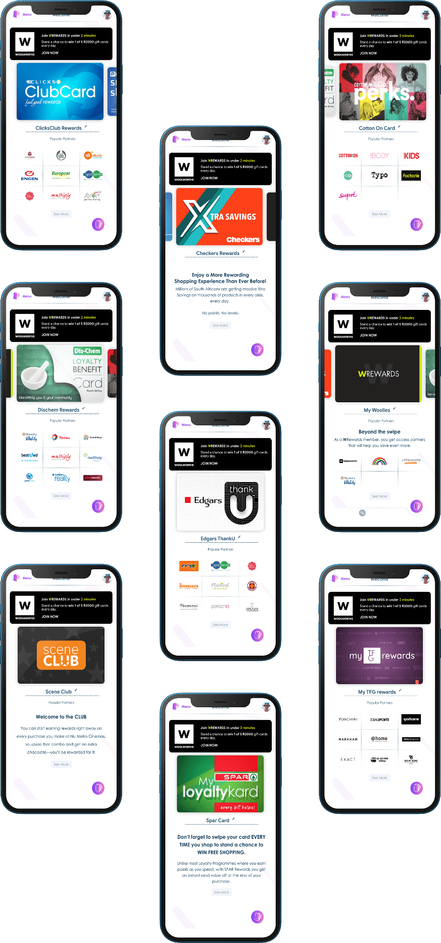
Currently, users can add 13 reward brands to the App, and more brands are still yet to be added.
Payments
Payments represent an experimental feature that explores how in-app payments could function. Users have the ability to utilize their pre-existing Apple Pay or Google Pay wallet to make purchases at various retail establishments. The app subsequently consolidates all expenses and presents the user with an overview of their expenditures.
Landing Page
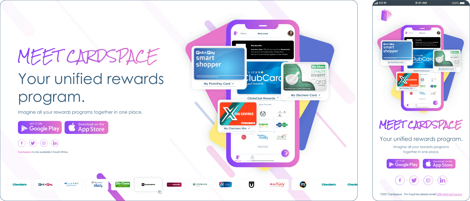
The landing page is a distinct webpage developed explicitly for marketing objectives. This is where a user arrives after clicking on a link from one of the CardSpace emails, or advertisements on Google, Facebook, and Instagram. The primary intent of the landing page is to have a single focus or objective, specifically a call-to-action (CTA).
App Store
Google Play Store

It's time to replace your physical wallet with a digital one.
Who needs a physical wallet when you can have all your cards in a single App?
Try CardSpace, your all in one mobile wallet today!


It's time to replace your physical wallet with a digital one.
Who needs a physical wallet when you can have all your cards in a single App? Try CardSpace, your all in one mobile wallet today!

Project
Meet CardSpace
Role
UX/UI Research, Prototyping, Interaction, UI Design, User Testing.
Tools
Figma, Protopie, Photoshop, Rotato
About CardSpace
CardSpace offers a feature that enables users to add their loyalty rewards cards to their applications and manually scan them while checking out. In essence, CardSpace is a centralized rewards program that consolidates all of a user's rewards programs into a single location.
The first stage involves allowing users to add various rewards cards that they can effortlessly scan at the counter.
In the second stage, the concept will be validated based on user feedback, and other retail cards will be added.
The third stage involves contemplating the inclusion of documents such as COVID-19 certificates, IDs, and other crucial documents into the wallet.
The fourth and final stage entails integrating with payment wallets like Apple Pay, allowing users to make payments directly from their mobile phones and monitor their expenditures at various retail establishments.

Building the Design System
A Design System serves as the definitive source of information that enables swift product realization and development in design. By utilising a compilation of reusable components and a standardised set of guidelines that dictate the usage of these components, I can enhance my speed of innovation and creation.
Main Colours

Gradients

Font Type
When it comes to typography, my fundamental strategy is to consistently choose the appropriate font. To ensure optimal usability and development, I favor either using a single font type or a maximum of two. It is imperative that the fonts are clean and not excessively condensed. Choosing fonts that are easy to read is crucial in delivering an exceptional user experience.


Icon Library
I opted to use the Material Design Icons, which are free and offer a flexible framework of principles, elements, and resources that promote the most effective approaches to user interface design. Supported by open-source code, the Material icons simplify collaboration between designers and developers, allowing teams to swiftly create visually appealing products.

Brand Logo's
CardSpace facilitates a connection between brands and users, and sourcing logos from various brand partners and generating master components of each for repeated use throughout the app proved to be one of the most significant hurdles in designing CardSpace.

Loyalty Cards
Another major obstacle was obtaining loyalty cards. Many of the cards discovered online were of inferior quality, with low resolution. Attempts to scan the cards proved to be unsuccessful, leaving no option but to redesign them, which required a considerable amount of effort.

Design Process
My design process entails mentally deconstructing significant design challenges into smaller, more manageable tasks. By defining the issue, gathering information, and brainstorming concepts, I can readily devise solutions that effectively address the underlying problem.

Mind Mapping
Getting caught up in minutiae is a common pitfall, which is why obtaining a comprehensive view of the user journey is vital for generating appropriate ideas. By utilising a mind map, I can prioritise essential features and maintain a user-centric focus.

Onboarding
CardSpace's onboarding procedure involves a succession of screens that direct the app's interface. This facilitates improved communication between businesses and their customers, enhancing the overall user experience. Specifically, it enables CardSpace to:
Educate users about the app's functions and advantages.
Enable users to register their login credentials.
Gather profile information that can be leveraged to deliver customized content and notifications.

Sign up/in
CardSpace offers users the option to either sign in/sign up using their social media accounts or via email.

Main Screens
The main used screens for the App..


Other Brands Screens
Currently, users can add 13 reward brands to the App, and more brands are still yet to be added.

Payments
Payments represent an experimental feature that explores how in-app payments could function. Users have the ability to utilize their pre-existing Apple Pay or Google Pay wallet to make purchases at various retail establishments. The app subsequently consolidates all expenses and presents the user with an overview of their expenditures.

Landing Page
The landing page is a distinct webpage developed explicitly for marketing objectives. This is where a user arrives after clicking on a link from one of the CardSpace emails, or advertisements on Google, Facebook, and Instagram. The primary intent of the landing page is to have a single focus or objective, specifically a call-to-action (CTA).

App Store

Google Play Store


It's time to replace your physical wallet with a digital one.
Who needs a physical wallet when you can have all your cards in a single App?
Try CardSpace, your all in one mobile wallet today!


It's time to replace your physical wallet with a digital one.
Who needs a physical wallet when you can have all your cards in a single App? Try CardSpace, your all in one mobile wallet today!

Project
Meet CardSpace
Role
UX/UI Research, Prototyping, Interaction, UI Design, User Testing.
Tools
Figma, Protopie, Photoshop, Rotato
About CardSpace
CardSpace offers a feature that enables users to add their loyalty rewards cards to their applications and manually scan them while checking out. In essence, CardSpace is a centralized rewards program that consolidates all of a user's rewards programs into a single location.
The first stage involves allowing users to add various rewards cards that they can effortlessly scan at the counter.
In the second stage, the concept will be validated based on user feedback, and other retail cards will be added.
The third stage involves contemplating the inclusion of documents such as COVID-19 certificates, IDs, and other crucial documents into the wallet.
The fourth and final stage entails integrating with payment wallets like Apple Pay, allowing users to make payments directly from their mobile phones and monitor their expenditures at various retail establishments.

Building the Design System
A Design System serves as the definitive source of information that enables swift product realization and development in design. By utilising a compilation of reusable components and a standardised set of guidelines that dictate the usage of these components, I can enhance my speed of innovation and creation.
Main Colours

Gradients

Font Type
When it comes to typography, my fundamental strategy is to consistently choose the appropriate font. To ensure optimal usability and development, I favor either using a single font type or a maximum of two. It is imperative that the fonts are clean and not excessively condensed. Choosing fonts that are easy to read is crucial in delivering an exceptional user experience.


Icon Library
I opted to use the Material Design Icons, which are free and offer a flexible framework of principles, elements, and resources that promote the most effective approaches to user interface design. Supported by open-source code, the Material icons simplify collaboration between designers and developers, allowing teams to swiftly create visually appealing products.

Brand Logo's
CardSpace facilitates a connection between brands and users, and sourcing logos from various brand partners and generating master components of each for repeated use throughout the app proved to be one of the most significant hurdles in designing CardSpace.

Loyalty Cards
Another major obstacle was obtaining loyalty cards. Many of the cards discovered online were of inferior quality, with low resolution. Attempts to scan the cards proved to be unsuccessful, leaving no option but to redesign them, which required a considerable amount of effort.

Design Process
My design process entails mentally deconstructing significant design challenges into smaller, more manageable tasks. By defining the issue, gathering information, and brainstorming concepts, I can readily devise solutions that effectively address the underlying problem.

Mind Mapping
Getting caught up in minutiae is a common pitfall, which is why obtaining a comprehensive view of the user journey is vital for generating appropriate ideas. By utilising a mind map, I can prioritise essential features and maintain a user-centric focus.

Onboarding
CardSpace's onboarding procedure involves a succession of screens that direct the app's interface. This facilitates improved communication between businesses and their customers, enhancing the overall user experience. Specifically, it enables CardSpace to:
Educate users about the app's functions and advantages.
Enable users to register their login credentials.
Gather profile information that can be leveraged to deliver customized content and notifications.

Sign up/in
CardSpace offers users the option to either sign in/sign up using their social media accounts or via email.

Main Screens
The main used screens for the App..


Other Brands Screens
Currently, users can add 13 reward brands to the App, and more brands are still yet to be added.

Payments
Payments represent an experimental feature that explores how in-app payments could function. Users have the ability to utilize their pre-existing Apple Pay or Google Pay wallet to make purchases at various retail establishments. The app subsequently consolidates all expenses and presents the user with an overview of their expenditures.

Landing Page
The landing page is a distinct webpage developed explicitly for marketing objectives. This is where a user arrives after clicking on a link from one of the CardSpace emails, or advertisements on Google, Facebook, and Instagram. The primary intent of the landing page is to have a single focus or objective, specifically a call-to-action (CTA).

App Store

Google Play Store


It's time to replace your physical wallet with a digital one.
Who needs a physical wallet when you can have all your cards in a single App?
Try CardSpace, your all in one mobile wallet today!


It's time to replace your physical wallet with a digital one.
Who needs a physical wallet when you can have all your cards in a single App? Try CardSpace, your all in one mobile wallet today!

Project
Meet CardSpace
Role
UX/UI Research, Prototyping, Interaction, UI Design, User Testing.
Tools
Figma, Protopie, Photoshop, Rotato
About CardSpace
CardSpace offers a feature that enables users to add their loyalty rewards cards to their applications and manually scan them while checking out. In essence, CardSpace is a centralized rewards program that consolidates all of a user's rewards programs into a single location.
The first stage involves allowing users to add various rewards cards that they can effortlessly scan at the counter.
In the second stage, the concept will be validated based on user feedback, and other retail cards will be added.
The third stage involves contemplating the inclusion of documents such as COVID-19 certificates, IDs, and other crucial documents into the wallet.
The fourth and final stage entails integrating with payment wallets like Apple Pay, allowing users to make payments directly from their mobile phones and monitor their expenditures at various retail establishments.

Building the Design System
A Design System serves as the definitive source of information that enables swift product realization and development in design. By utilising a compilation of reusable components and a standardised set of guidelines that dictate the usage of these components, I can enhance my speed of innovation and creation.
Main Colours

Gradients

Font Type
When it comes to typography, my fundamental strategy is to consistently choose the appropriate font. To ensure optimal usability and development, I favor either using a single font type or a maximum of two. It is imperative that the fonts are clean and not excessively condensed. Choosing fonts that are easy to read is crucial in delivering an exceptional user experience.


Icon Library
I opted to use the Material Design Icons, which are free and offer a flexible framework of principles, elements, and resources that promote the most effective approaches to user interface design. Supported by open-source code, the Material icons simplify collaboration between designers and developers, allowing teams to swiftly create visually appealing products.

Brand Logo's
CardSpace facilitates a connection between brands and users, and sourcing logos from various brand partners and generating master components of each for repeated use throughout the app proved to be one of the most significant hurdles in designing CardSpace.

Loyalty Cards
Another major obstacle was obtaining loyalty cards. Many of the cards discovered online were of inferior quality, with low resolution. Attempts to scan the cards proved to be unsuccessful, leaving no option but to redesign them, which required a considerable amount of effort.

Design Process
My design process entails mentally deconstructing significant design challenges into smaller, more manageable tasks. By defining the issue, gathering information, and brainstorming concepts, I can readily devise solutions that effectively address the underlying problem.

Mind Mapping
Getting caught up in minutiae is a common pitfall, which is why obtaining a comprehensive view of the user journey is vital for generating appropriate ideas. By utilising a mind map, I can prioritise essential features and maintain a user-centric focus.

Onboarding
CardSpace's onboarding procedure involves a succession of screens that direct the app's interface. This facilitates improved communication between businesses and their customers, enhancing the overall user experience. Specifically, it enables CardSpace to:
Educate users about the app's functions and advantages.
Enable users to register their login credentials.
Gather profile information that can be leveraged to deliver customized content and notifications.

Sign up/in
CardSpace offers users the option to either sign in/sign up using their social media accounts or via email.

Main Screens
The main used screens for the App..


Other Brands Screens
Currently, users can add 13 reward brands to the App, and more brands are still yet to be added.

Payments
Payments represent an experimental feature that explores how in-app payments could function. Users have the ability to utilize their pre-existing Apple Pay or Google Pay wallet to make purchases at various retail establishments. The app subsequently consolidates all expenses and presents the user with an overview of their expenditures.

Landing Page
The landing page is a distinct webpage developed explicitly for marketing objectives. This is where a user arrives after clicking on a link from one of the CardSpace emails, or advertisements on Google, Facebook, and Instagram. The primary intent of the landing page is to have a single focus or objective, specifically a call-to-action (CTA).

App Store

Google Play Store


It's time to replace your physical wallet with a digital one.
Who needs a physical wallet when you can have all your cards in a single App?
Try CardSpace, your all in one mobile wallet today!


It's time to replace your physical wallet with a digital one.
Who needs a physical wallet when you can have all your cards in a single App? Try CardSpace, your all in one mobile wallet today!

Project
Meet CardSpace
Role
UX/UI Research, Prototyping, Interaction, UI Design, User Testing.
Tools
Figma, Protopie, Photoshop, Rotato
About CardSpace
CardSpace offers a feature that enables users to add their loyalty rewards cards to their applications and manually scan them while checking out. In essence, CardSpace is a centralized rewards program that consolidates all of a user's rewards programs into a single location.
The first stage involves allowing users to add various rewards cards that they can effortlessly scan at the counter.
In the second stage, the concept will be validated based on user feedback, and other retail cards will be added.
The third stage involves contemplating the inclusion of documents such as COVID-19 certificates, IDs, and other crucial documents into the wallet.
The fourth and final stage entails integrating with payment wallets like Apple Pay, allowing users to make payments directly from their mobile phones and monitor their expenditures at various retail establishments.

Building the Design System
A Design System serves as the definitive source of information that enables swift product realization and development in design. By utilising a compilation of reusable components and a standardised set of guidelines that dictate the usage of these components, I can enhance my speed of innovation and creation.
Main Colours

Gradients

Font Type
When it comes to typography, my fundamental strategy is to consistently choose the appropriate font. To ensure optimal usability and development, I favor either using a single font type or a maximum of two. It is imperative that the fonts are clean and not excessively condensed. Choosing fonts that are easy to read is crucial in delivering an exceptional user experience.


Icon Library
I opted to use the Material Design Icons, which are free and offer a flexible framework of principles, elements, and resources that promote the most effective approaches to user interface design. Supported by open-source code, the Material icons simplify collaboration between designers and developers, allowing teams to swiftly create visually appealing products.

Brand Logo's
CardSpace facilitates a connection between brands and users, and sourcing logos from various brand partners and generating master components of each for repeated use throughout the app proved to be one of the most significant hurdles in designing CardSpace.

Loyalty Cards
Another major obstacle was obtaining loyalty cards. Many of the cards discovered online were of inferior quality, with low resolution. Attempts to scan the cards proved to be unsuccessful, leaving no option but to redesign them, which required a considerable amount of effort.

Design Process
My design process entails mentally deconstructing significant design challenges into smaller, more manageable tasks. By defining the issue, gathering information, and brainstorming concepts, I can readily devise solutions that effectively address the underlying problem.

Mind Mapping
Getting caught up in minutiae is a common pitfall, which is why obtaining a comprehensive view of the user journey is vital for generating appropriate ideas. By utilising a mind map, I can prioritise essential features and maintain a user-centric focus.

Onboarding
CardSpace's onboarding procedure involves a succession of screens that direct the app's interface. This facilitates improved communication between businesses and their customers, enhancing the overall user experience. Specifically, it enables CardSpace to:
Educate users about the app's functions and advantages.
Enable users to register their login credentials.
Gather profile information that can be leveraged to deliver customized content and notifications.

Sign up/in
CardSpace offers users the option to either sign in/sign up using their social media accounts or via email.

Main Screens
The main used screens for the App..


Other Brands Screens
Currently, users can add 13 reward brands to the App, and more brands are still yet to be added.

Payments
Payments represent an experimental feature that explores how in-app payments could function. Users have the ability to utilize their pre-existing Apple Pay or Google Pay wallet to make purchases at various retail establishments. The app subsequently consolidates all expenses and presents the user with an overview of their expenditures.

Landing Page
The landing page is a distinct webpage developed explicitly for marketing objectives. This is where a user arrives after clicking on a link from one of the CardSpace emails, or advertisements on Google, Facebook, and Instagram. The primary intent of the landing page is to have a single focus or objective, specifically a call-to-action (CTA).

App Store

Google Play Store


It's time to replace your physical wallet with a digital one.
Who needs a physical wallet when you can have all your cards in a single App?
Try CardSpace, your all in one mobile wallet today!


It's time to replace your physical wallet with a digital one.
Who needs a physical wallet when you can have all your cards in a single App? Try CardSpace, your all in one mobile wallet today!

Project
Meet CardSpace
Role
UX/UI Research, Prototyping, Interaction, UI Design, User Testing.
Tools
Figma, Protopie, Photoshop, Rotato
About CardSpace
CardSpace offers a feature that enables users to add their loyalty rewards cards to their applications and manually scan them while checking out. In essence, CardSpace is a centralized rewards program that consolidates all of a user's rewards programs into a single location.
The first stage involves allowing users to add various rewards cards that they can effortlessly scan at the counter.
In the second stage, the concept will be validated based on user feedback, and other retail cards will be added.
The third stage involves contemplating the inclusion of documents such as COVID-19 certificates, IDs, and other crucial documents into the wallet.
The fourth and final stage entails integrating with payment wallets like Apple Pay, allowing users to make payments directly from their mobile phones and monitor their expenditures at various retail establishments.

Building the Design System
A Design System serves as the definitive source of information that enables swift product realization and development in design. By utilising a compilation of reusable components and a standardised set of guidelines that dictate the usage of these components, I can enhance my speed of innovation and creation.
Main Colours

Gradients

Font Type
When it comes to typography, my fundamental strategy is to consistently choose the appropriate font. To ensure optimal usability and development, I favor either using a single font type or a maximum of two. It is imperative that the fonts are clean and not excessively condensed. Choosing fonts that are easy to read is crucial in delivering an exceptional user experience.


Icon Library
I opted to use the Material Design Icons, which are free and offer a flexible framework of principles, elements, and resources that promote the most effective approaches to user interface design. Supported by open-source code, the Material icons simplify collaboration between designers and developers, allowing teams to swiftly create visually appealing products.

Brand Logo's
CardSpace facilitates a connection between brands and users, and sourcing logos from various brand partners and generating master components of each for repeated use throughout the app proved to be one of the most significant hurdles in designing CardSpace.

Loyalty Cards
Another major obstacle was obtaining loyalty cards. Many of the cards discovered online were of inferior quality, with low resolution. Attempts to scan the cards proved to be unsuccessful, leaving no option but to redesign them, which required a considerable amount of effort.

Design Process
My design process entails mentally deconstructing significant design challenges into smaller, more manageable tasks. By defining the issue, gathering information, and brainstorming concepts, I can readily devise solutions that effectively address the underlying problem.

Mind Mapping
Getting caught up in minutiae is a common pitfall, which is why obtaining a comprehensive view of the user journey is vital for generating appropriate ideas. By utilising a mind map, I can prioritise essential features and maintain a user-centric focus.

Onboarding
CardSpace's onboarding procedure involves a succession of screens that direct the app's interface. This facilitates improved communication between businesses and their customers, enhancing the overall user experience. Specifically, it enables CardSpace to:
Educate users about the app's functions and advantages.
Enable users to register their login credentials.
Gather profile information that can be leveraged to deliver customized content and notifications.

Sign up/in
CardSpace offers users the option to either sign in/sign up using their social media accounts or via email.

Main Screens
The main used screens for the App..


Other Brands Screens
Currently, users can add 13 reward brands to the App, and more brands are still yet to be added.

Payments
Payments represent an experimental feature that explores how in-app payments could function. Users have the ability to utilize their pre-existing Apple Pay or Google Pay wallet to make purchases at various retail establishments. The app subsequently consolidates all expenses and presents the user with an overview of their expenditures.

Landing Page
The landing page is a distinct webpage developed explicitly for marketing objectives. This is where a user arrives after clicking on a link from one of the CardSpace emails, or advertisements on Google, Facebook, and Instagram. The primary intent of the landing page is to have a single focus or objective, specifically a call-to-action (CTA).

App Store

Google Play Store


It's time to replace your physical wallet with a digital one.
Who needs a physical wallet when you can have all your cards in a single App?
Try CardSpace, your all in one mobile wallet today!

